
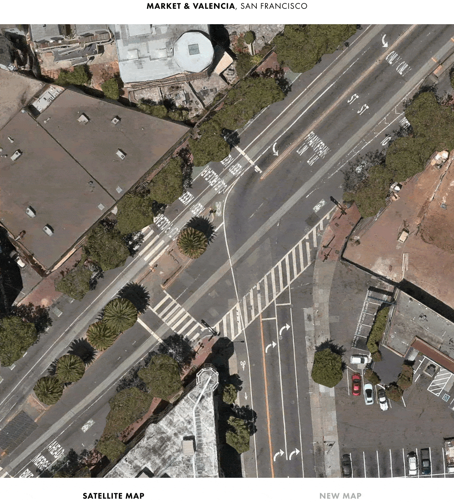
Screenshots of Apple Map’s Redesign
Recently Apple announced a number of new updates for their Maps app. This isn’t the first time they’ve made announcements like this, but the number of changes made to the actual maps is quite impressive. The question is, how can you see the differences? That is where Justin Beirne comes in. He has documented the changes Apple has made over the past several years. Well, he has come through once again with a page dedicated to what changes are coming this fall. If you are curious on what is new with Apple Maps, you may want to look at Justin’s page which shows visually the changes we can expect this fall.
This latest update arrives less than three years after Apple announced a completely new map. While Apple has gradually evolved Apple Maps’s appearance since its launch nine years ago, this is the first time that Apple has altered every aspect of the map’s look and feel at once.
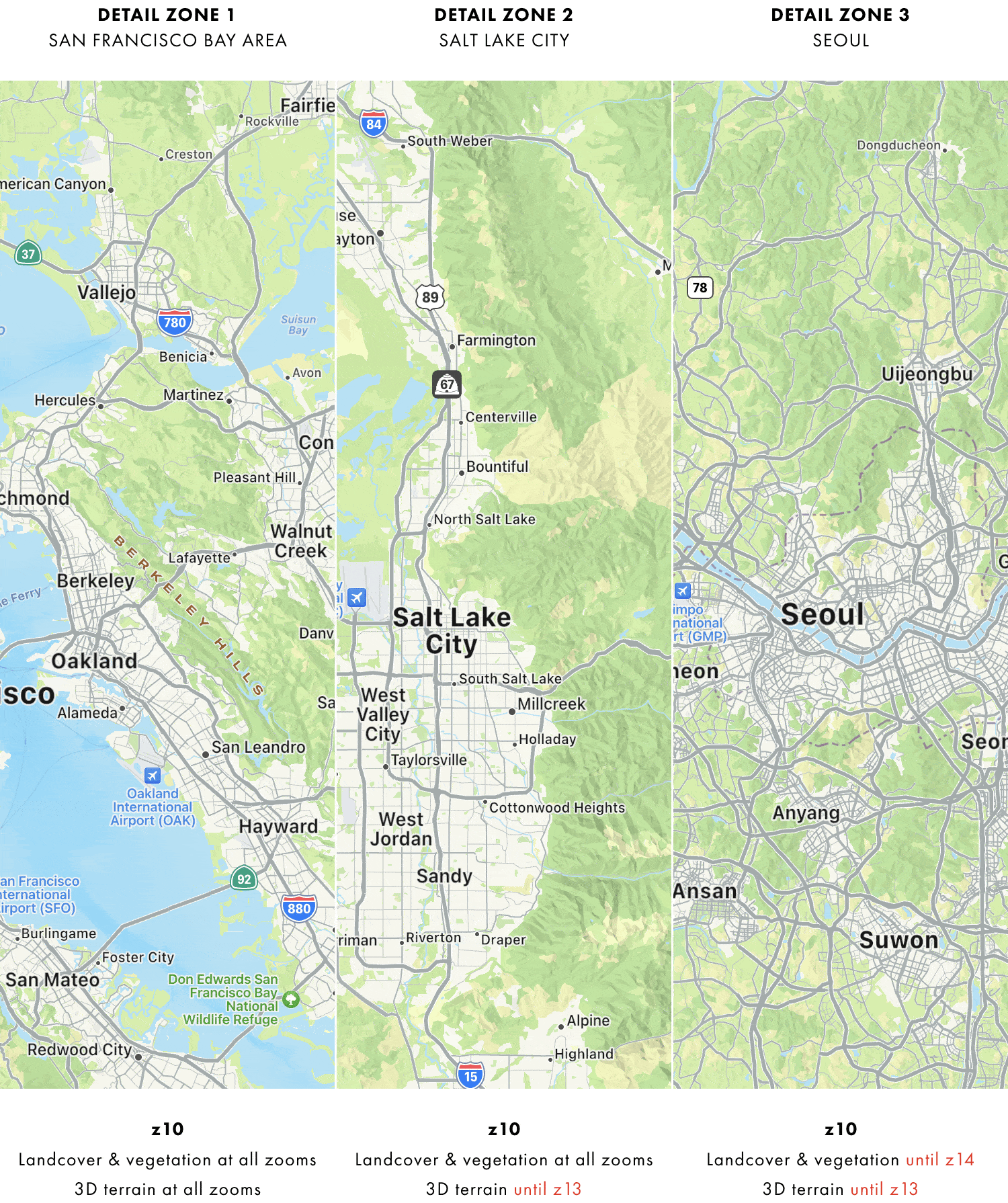
In addition to altering Apple Maps’s appearance, Apple has also added a large amount of new data and detail to its map—especially in the six countries currently covered by Apple’s new map and Japan, and even more so in the San Francisco Bay Area:
Check out Justin’s page to see a lot more of what has changed.


