Apple’s fiscal 2022 in charts
Last week Apple announced its fiscal fourth quarter results, setting another quarterly record amid a lot of concern on Wall Street about the standing of the tech industry. And as usual, I filled a bunch of numbers into a Number spreadsheet, ran my little chart script, and out popped out a bunch of colorful charts.
It being the fiscal fourth quarter, of course, means it’s also the end of Apple’s fiscal year. And that gives me the opportunity to cart out a separate set of charts, ones that take the longer view and show the changes in Apple’s business over an entire year.
(I sat down to write this story and looked up when I generated fiscal-year charts last year. Turns out it’s the same day, to the hour. I am nothing if not consistent.)
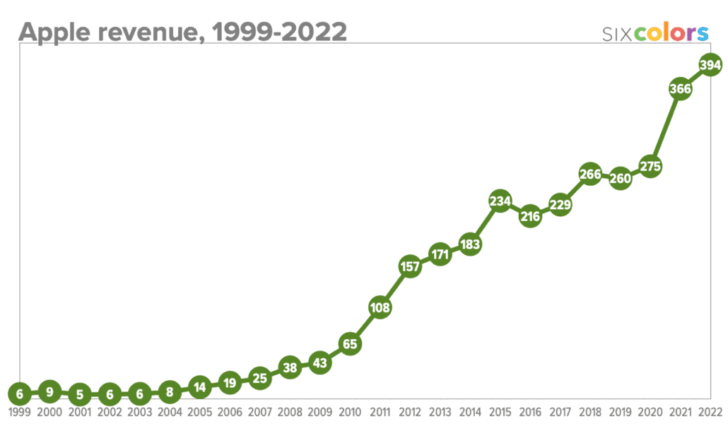
Anyway, let’s dig in to the charts, starting with the big one, overall Apple revenue for the last 24 years:

After the revenue rocketship that was fiscal 2021, this past year has been a little quieter. But it’s still remarkable that during a tumultuous time, politically and economically, Apple managed not to give back a dime of that $91 billion growth spurt and instead tacked on an additional $28 billion.

As you can see from this chart, the last two times Apple has posted a blow-out fiscal year—2015 and 2018—it has backslid the next year. That didn’t happen this year, as revenues were up 8% over the previous year.
Of course, the driver of half Apple’s revenue is the iPhone, so as the iPhone goes, so goes Apple:

At about 7% growth, Apple’s iPhone growth more or less matches the company’s overall growth. But it’s still a little bit interesting that Apple’s business overall grew more than the iPhone business did!
You can also see some of the gravity defying that Apple did this fiscal year. In fiscal 2015 and 2018, iPhone revenue spiked—spikes that align with the introduction of the iPhone 6 and iPhone X. In other words, major iPhone body redesigns.
The iPhone 12 was also a body redesign, and sales spiked in fiscal 2021—but went up further in 2022. Again, that’s not generally what happens, but it happened this past year.
Let’s look at the Mac, maybe the biggest success in Apple’s portfolio in 2022:

2021 was the Mac’s best year by a large margin. A lot of us nodded and said something about lockdown driving sales, but Apple kept saying that they felt there was still plenty of demand being driven by the Mac’s move to Apple silicon.
They were right. In 2022 the Mac added another $5 billion in revenue, a leap almost as huge as the one it made the year before. I don’t know how long it will last, but after a decade with Mac sales figures in the twenty billions, it lingered in the thirties for a single year before hitting 40. The Mac is riding high.
You know who’s not riding high? The iPad:

The iPad seems to me to be the product that really was affected by global conditions, including lockdowns and school closures, with a run of new sales that couldn’t be maintained into 2022. Still, as an iPad fan, I’m going to observe that $29 billion in a year is nothing to sneeze at and is a number that the iPad didn’t approach between 2015 and 2020.
Perhaps the iPad’s not going to regularly generate more than $30 billion in revenue every year. I don’t know. But this year was still the second-best year for the iPad out of the last eight. The real question is, does the needle move up or down for the iPad next year?
Now let’s look at the popular and growing Services and Wearables, Home, and Accessories lines:

As you might expect, they continue to grow. However, it’s worth noting that after a large step forward for both in 2021, both cooled off in 2022. This is something to keep an eye on because either Apple will need to revive these categories or they’re going to have to find some other category to point to when Wall Street demands growth.
(I’ll also point out that at $41 billion, the Wearables, Home, and Accessories category has surpassed total Mac revenue—even during the Mac’s best revenue year ever!)
This brings us to the final chart, which I run here every year just to put all of Apple’s product lines in the proper context. When I run the numbers as individual charts, they all seem more or less the same. But they are very definitely not all created equal. (It’s still impressive to see Services lift away from the others, though.)

Let’s meet back here next year for more charts, okay?


